These New Crew SC Jerseys Are Beautiful

These New Crew SC Jerseys Are Beautiful
by Grant Burkhardt

If we’re talkin’ style, the 2016 version of the Columbus Crew whiffed. It’s well documented, but again: Crew SC had a falling out with one of its best players (Kei Kamara) and missed the playoffs only a year after losing the MLS title match in overtime. And that’s not to mention the season was a rough one while the team was wearing genuinely ugly jerseys.
The infamous jersey reveal last year was this one, a hideous rendition of the Ohio state flag that the club deemed the “For Columbus” kit. The black home jerseys were fine, but the team’s sponsor deal with BARBASOL made it near-impossible to create a well-designed, symmetrical jersey (the Barbasol logo was too flat, too square, too clunky, too big, and has similar shortcomings as the Chevrolet logo on the Manchester United kits).
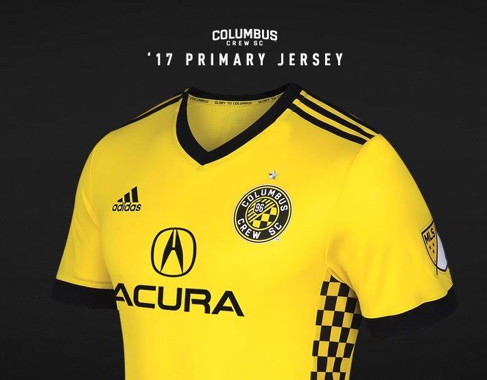
But! But but but! The team held a press conference Friday to announce its new sponsor partnership and its new 2017 home jersey…and it is so, so beautiful.

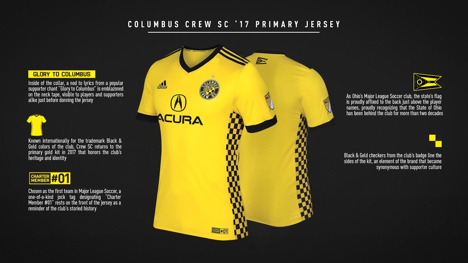
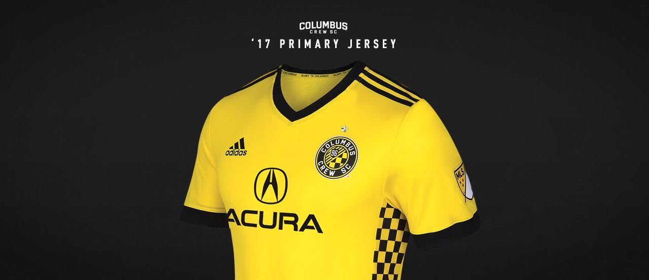
First, to the club for going back to yellow as the home jersey. The simplicity and detail of this jersey is stunning. Nothing crazy; all classic.
The new sponsor is Acura, which makes nearly all of its cars in Marysville, Ohio, and whose logo is a perfect color and shape fit for the center of the 2017 jersey. From a design perspective, it fits the empty yellow space well without being too dominating.
The Ohio state flag is on the back, the team’s championship star is above the breast logo, the club’s status as the first team in MLS is at the bottom, and the checkers on the rib cage – an homage to the flags and gear of the supporter groups – are a great detail to complement the yellow. The checkers go inside the body of the jersey for the equally classy away black unis.
Jersey reveals in soccer are a huge deal. Teams get more and more crazy each year, trying to incorporate new colors and new designs with the hope of creating the next Real Madrid dragon jersey or the blue Juventus away jerseys. Most times, though, simple is better. Use your team colors. Don’t change the direction of your famous stripes (Barcelona, looking your way).
Crew SC roofed this one. A hard 10.
BROUGHT TO YOU BY


