Meet the new CBJ jerseys that look nearly identical to the old ones

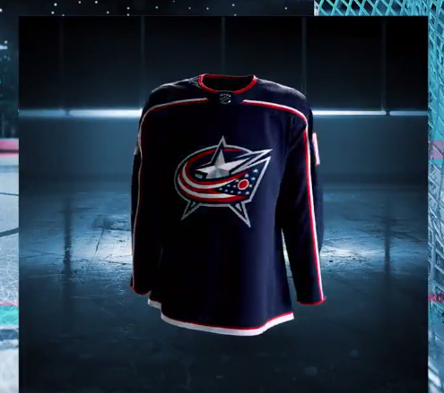
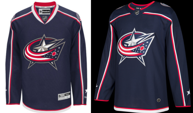
Our boys in blue earned themselves some sick new duds for next season. Actually, they look pretty much exactly the same. Here’s what the CBJ players were wearing last year (left) next to the new guy (right):
Here’s another look at the jersey:
It’s been a big night.
Here is the new #CBJ jersey: pic.twitter.com/yjhU2R2bAm
— ColumbusBlueJackets (@BlueJacketsNHL) June 21, 2017
At first glance, they pretty much look identical but if you push up your glasses and wrinkle your nose, you can notice a few changes. The Columbus hockey franchise dropped Reebok for Adidas, switched up the logo just a tad, and made very minor adjustments to the color and trim.
We’ve left the bad news for last.. There will be no alternative jerseys this year. Adidas didn’t go to the effort. So cling tightly to your light blue CBJ shirt with a large cannon insignia on the front. Rock it to sleep, it’s precious.
[symple_button url=”http://www.10tv.com/article/columbus-blue-jackets-unveil-new-look-201718-season” color=”black” button_target=”_self”]Read more[/symple_button]BROUGHT TO YOU BY


