Change in the wind: Designer advocates for new Columbus flag
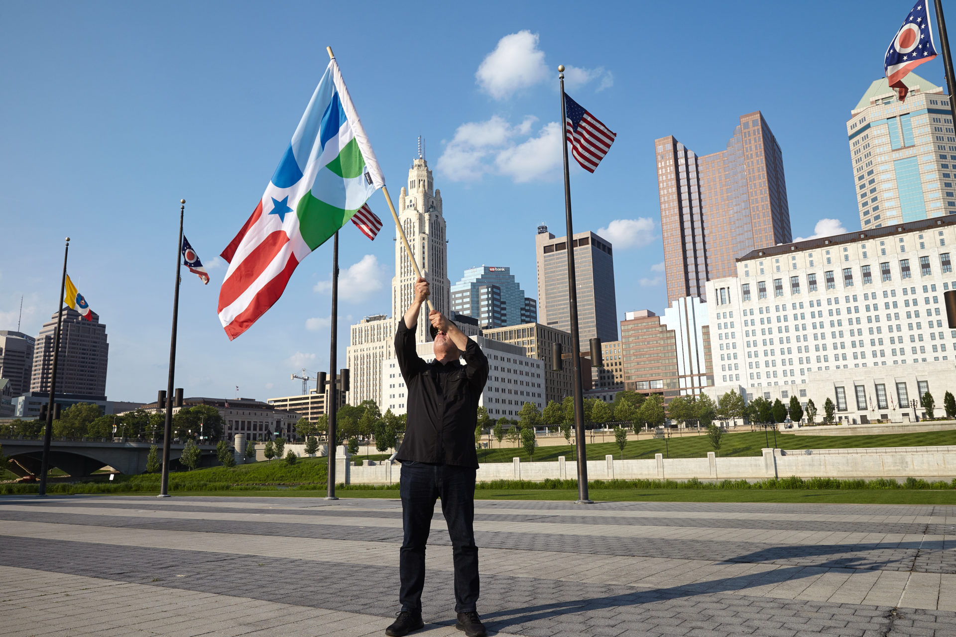
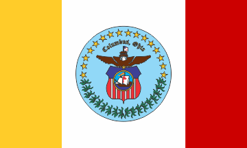
Pop Quiz: What does the City of Columbus flag look like?
If you don’t know, you’re not alone. And even if you do, you probably aren’t too excited about it. But maybe that can change, and should change.
At least that’s the opinion of an army of armchair vexillologists (flag geeks), who think many of our obscure symbols of civic pride nationwide are overdue for an upgrade.
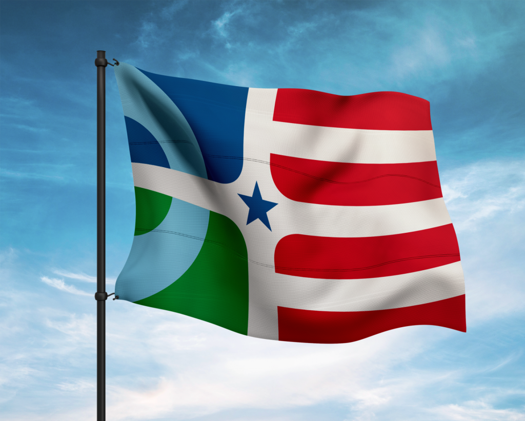
“I didn’t even realize what our city flag looked like. I’m sure I’d seen it before, but never really paid much attention to it,” confessed Paul Nini, OSU design professor, and creator of The People’s Flag of Columbus. “This situation of a city flag like we have is pretty common because they’re generally created by governments, not designers. They just have the official seal and whatever else they throw on there.”
Nini was inspired by Roman Mars, Newark native and host of the prolific design-focused podcast 99% Invisible. Mars also happened to be the keynote speaker at an industry conference Nini attended in 2015 and the idea stuck.
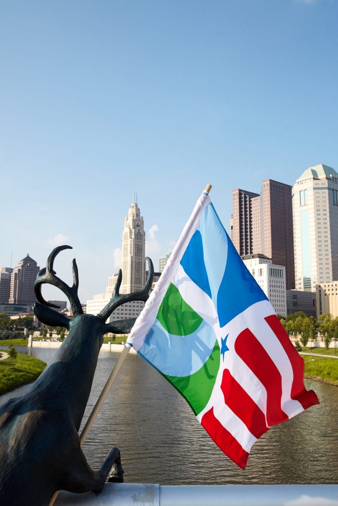
“I tried to follow the basic rules of what makes a great flag. The design should be simple and memorable and have meaning behind the forms,” he explained. “It has negative white spaces that come through the center representing Broad and High, with the star as a symbol that we’re the state capital. The fields of blue and green with a semicircle represent the Scioto River and the Franklinton peninsula, the heart of the city, the original area of downtown. Anything more complicated gets tricky.”
For those who may not know, the current city flag is only the latest incarnation, with several since its inception.
Over time, it’s come to incorporate images of the statehouse, Buckeye leaves, and the Santa Maria, along with the typical eagle, stars, and other stuff shared by nearly every flag of the era.
But it’s all so cluttered and compressed, you have to squint to even make any of it out.
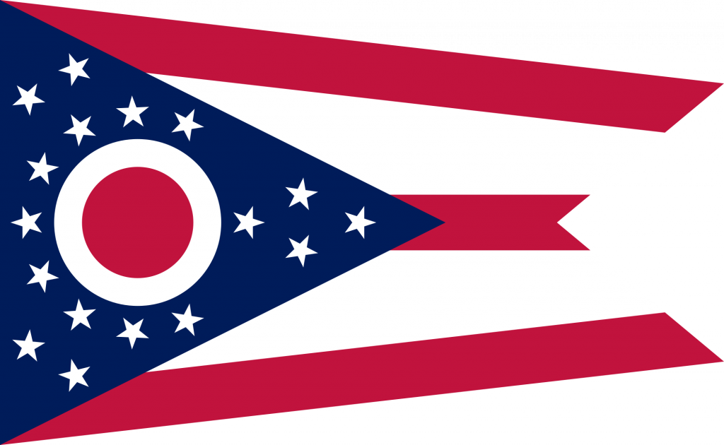
In contrast, Ohio’s swallowtail burgee is the rock star of state flags, cited by historians and designers alike as a prime example of following the rules, but still breaking them.
For more than a century, Ohio didn’t even have an official flag. But Cleveland architect John Eisenmann’s design and the symbolism behind it still feel modern, unlike the Columbus flag, despite being about the same age.
“The original proposal tried to use the original colors, to get the city interested in it,” Nini recalled. “This was before Ginther was elected mayor and was still City Council president. I talked to his chief of staff who essentially said, ‘This is nice, but it isn’t really on our radar.’”
Reluctance is pretty typical as well. The current design was created by a CPD officer, denoted by the shield.
That and the contemporary controversy over the city’s namesake are where sentiment and sensitivity collide. Even if our flag wasn’t what critics call a “badge on a bed sheet,” changing it won’t be easy.
BROUGHT TO YOU BY
“That’s very different than a city like Chicago with its four six-pointed stars embraced by everyone, from city government to its citizens,” noted Nini. “They love it. They use it everywhere. It’s a symbol of pride for the city.”
Nini was raised in Clintonville and still calls it home, but a recent grad school reunion in Chicago only reinforced his resolve that Columbus is a city that is changing, and our flag should reflect that.
“I was at my alma mater and friends and faculty were saying, ‘We keep hearing how cool Columbus is now,’” he said. “That’s what’s happening, and our flag should be a symbol of the city and where we are going. Whether or not everyone is going to get behind it, I have no idea.”
Nini isn’t the only one vexed by our city flag, though his design does seem to have the most traction.
There’s an alternate concept that maintains the current color scheme and features a compass rose, a more iconic reference to Christopher Columbus. There’s even a “Bad Flags” blog based in Columbus with the snarky suggestion of a giant ice cream cone as a more accurate and less divisive symbol for the city.
“I decided not to worry about the government and rebrand it ‘The People’s Flag’ and promote it that way—a path of least resistance,” he chided. “Having been involved in lots of things over the years—as a musician, I’ve been in bands—I’ve learned it’s always best to keep your expectations low, because then you don’t get too disappointed.”
All great ideas get pushback. But we live in a branded city in a branded age.
Former Mayor Coleman had the foresight to enlist local agency Ologie to help define and design the city’s visual identity. The flag wasn’t included in that effort, perhaps a hint of how truly invisible municipal flags have become.
“Last summer, I finally found a place that would do on-demand printing and fabrication of flags. Everywhere else I found before would make the flags, but I’d have to buy like a hundred of them and handle all of the sales and shipping myself,” he said. “Now you can buy just one, for anyone who wants to fly it. There are also t-shirts, buttons, decals… if you don’t want to buy a flag, you can still show your support.”
Those supporters have swelled beyond his students and the creative community, and literally letting folks put his idea into the wind has been a winning strategy in other cities where initial proposals to update their flags also fell flat. It’s a battle of attrition, but not a bitter one.
“Having grown up here in the ’60s and ’70s, the city has grown up too. People love the city now and appreciate it for what it’s become,” Nini said, hoping that organic adoption and a few influential brand champions can find the inroads that have thus far remained elusive. “If I drive by homes and local businesses that are flying the flag with pride, that’s the point. A flag should be something people can rally around, a brand that brings communities together. Even if the city doesn’t see it yet, hopefully they will.”
By J.R. McMillan / (614) July, 2018
BROUGHT TO YOU BY


